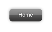
One of the most common Photoshop tasks is making shiny buttons. Have a look at the current Apple website. They have a menu bar with glossy gray buttons with white text. Some roundness and shape makes the buttons more interesting than if they were just a flat color.
Let's make our own glossy buttons from scratch with Photoshop.
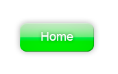
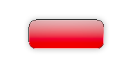
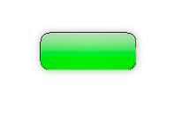
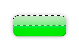
Ours will look something like this:
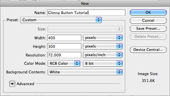
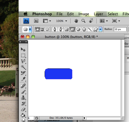
Start up photoshop and create a new file (file -> new). Set the size to 400x300 pixels so we have a comfortable work area.
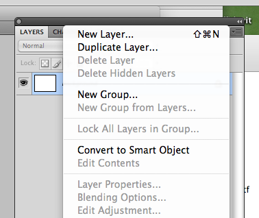
Now find the layer menu, probably over on the right side of your screen. If it isn't visible, you can turn it on in the view menu.
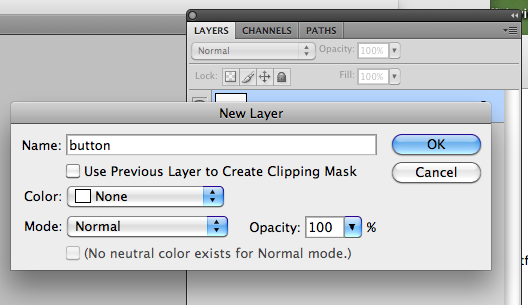
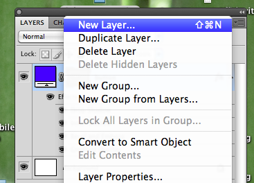
The upper right side of this panel has a little icon that looks like a window grate. Click on the corner arrow and a menu will drop down. Select "New Layer".
A iailog will come up and ask you to name the new layer. Make it look like this:
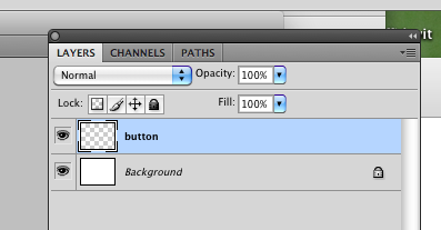
Click on the button layer to make it active. That means the objects we draw next will be on that layer.
Excellent.
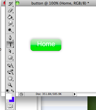
Now create a rounded rectangle object that will be the basic form of our new button. The icon for rounded corner rectangles is found in the lower part of the tool bar. In my version it's two below the text tool, as shown in this image:
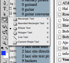
Sometimes the tools we want are hidden under other tools. In this case, I'm going to have to hold the mouse for a moment on the elipse tool and then it gives me a choice of similar tools, and I will choose rounded rectangle. If the corners are too sharp you can adjust the settings of the rounded rect tool by clicking on the radius setting in the main menu at the top of the page.
You can set the radius here, in the menu bar at the top of the window. RIght now it's set to 10 pixels. Make this number larger for more roundness, smaller for sharper corners, zero for a rectangle without roundness:
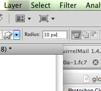
The radius is the size of the curve that we see at the corners.
Now, draw the overall shape of the button with this tool.
The object you have drawn is an outline with a fill color, rather than a bitmap object, so it behaves a little different than a bitmap.
Note: the color at this stage doesn't mater. You can set the color by clicking on the litle icon in the layer list, but the actual color of the button will be set later on when we create a gradient.
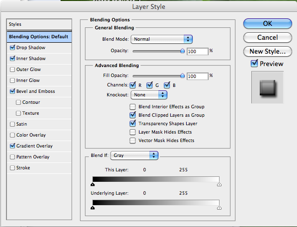
We're now going to set a number of layer settings.
Double click on the layer and look at the blending options.
We will set four of them. For each one, click the little box to turn the feature on, then double click on the name of the style to get the detailed options.
Your version may have these in a different order but the options you want to click are drop shadow, inner shadow, bevel, and gradient.
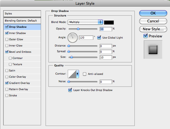
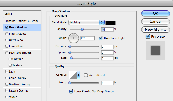
Click the check box for "Drop Shadow" options and then set the options like this:
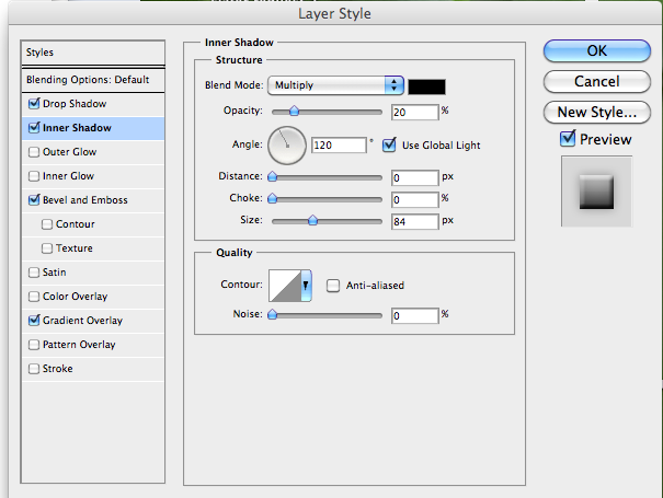
Inner shadow options should look like this:
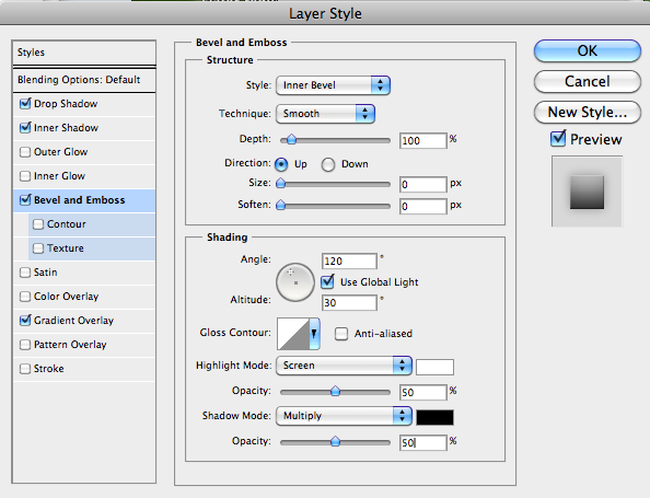
Bevel and Emboss options:
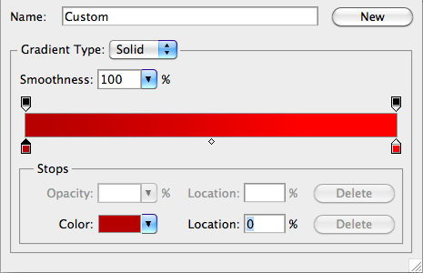
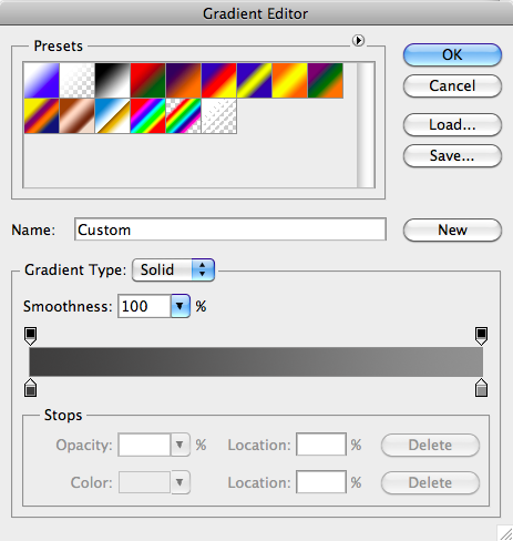
Gradient Overlay is the last layer option we're going to turn on. This sets the overall color of the button.
The gradient is a bit tricky to set. Double click on the line between the two colors and it will give you the options. You can also click on the color samples at either end of the bar, to reset the colors. You want to have two colors that are similar in value, but one darker than the other. I'm using red but you can use any color you like.
To select a color click on the little crayon icons.
Try to make your gradient be a light color and a dark color that are the same hue, such as red or green. This hue will be the colo of your button.
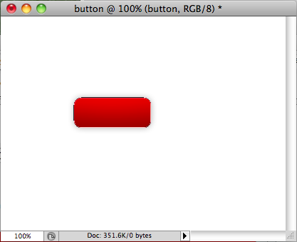
Here's an example done with red:
If you have set everything correctly your image is going to look like this:
If youchange the gradient a bit you can make the button brighter or even a different color. Double click on the layer, then double click on the gradient, then click on the colors at each end to reset the gradient:
The buttons are starting to look like Jolly Rancher candies.
Let's add a hilight/reflective area to make the button look glassy.
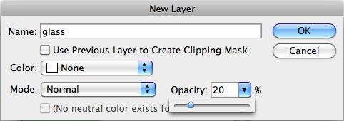
Create a new layer called "glass". Go to the layer panel, select the menu in the upper right corner, and select "New Layer".
The settings box will come up. Set the name for the layer, and set the opacity to 20% so that the layer settings box looks like this:
Our next goal is to draw the shiny area.
This will require a bit of a trick on the selection.
Select the "Marquee" tool, which is the rectangular selection area tool found near the top of the tool panel.
![]()
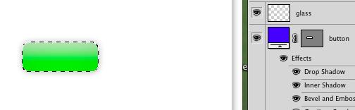
We have this tool selected, right? Ok, now hold the "Command" key (lower left on the Mac keyboard) or "Control" (on Windows) and at the same time go to the Layers panel and click on the layer with the button image. You need to click on the little icon of the layer, not on the name.
In the following picture, you hold "command" and click on the dark rectangle next to the word "button" and you get this nice selection area around the button.
Now hold the option key (alt on Windows) to subtract from the selection area, then draw a rectangle covering the lower half of the button. This will eliminate half of the selection area. Try to make it look like this:
Make sure the "button" layer is selected.
Now keeping the selection, make sure you have white color selected. If it's not, you can double click on the foreground color area of the tool bar (the white area in the following image) and then choose white from the color palette. Or, if white is the background color, you can click the little arrows button above/right from the color samples, upper right in the following image. That will swap foreground and background colors.
![]()
Choose the paintbucket tool and use it to fill the selected area on the upper half of the button.
![]()
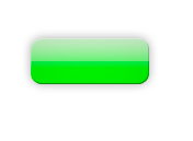
Your final result should look like this:
Let's put some text on the button. Set the foreground color to white (click on color samples to do this) and then set the font tools options for Arial, 24 point. The font options panel comes up when you select the text tool from the tool palette. It should look like this:
![]()
Here's the text in place.
Note that the text is the first (top) layer in the layer panel. If for some reason it's not, then drag it to the top of the list. We don't want to have our text under the button!
Set a little drop shadow on the text by double clicking on the text layer. Select "drop shadow" and then double click "drop shadow" to get the options and set them like this:
You can use the move tool to move the text around and line it up nicely. I think I'm going to reduce the text size a little bit too. After a little tweaking it looks like this:
If you are happy with this, then you will probably want to crop it. Use the rectangle select tool to select the area you want to keep, then choose "crop" from the "image" menu.
You can output the file using the "save for web" tool in the file menu.
If you want to make a gray button like the one in the apple website, try the following steps.
Duplicate the button layer. Do this by selecting the layer in the layer panel, then choose the "duplicate layer" from the layer menu which is a pull down from the upper right corner of the layer panel.
Turn off the original (green button) layer. We want to keep this intact, just in case.
Now double click on the layer's "Gradient" option to bring up the options and set a new color span, as we did before.
Here are my settings
And here's the final result: